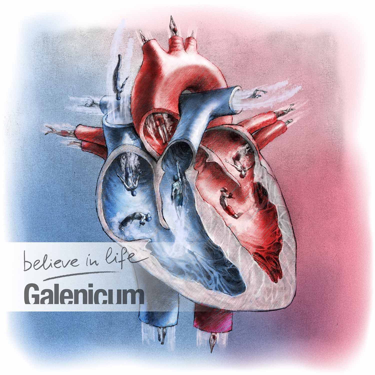
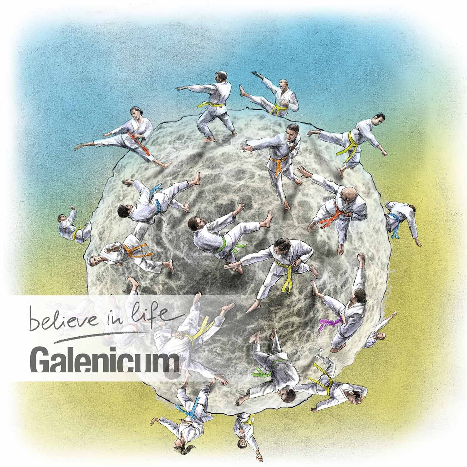
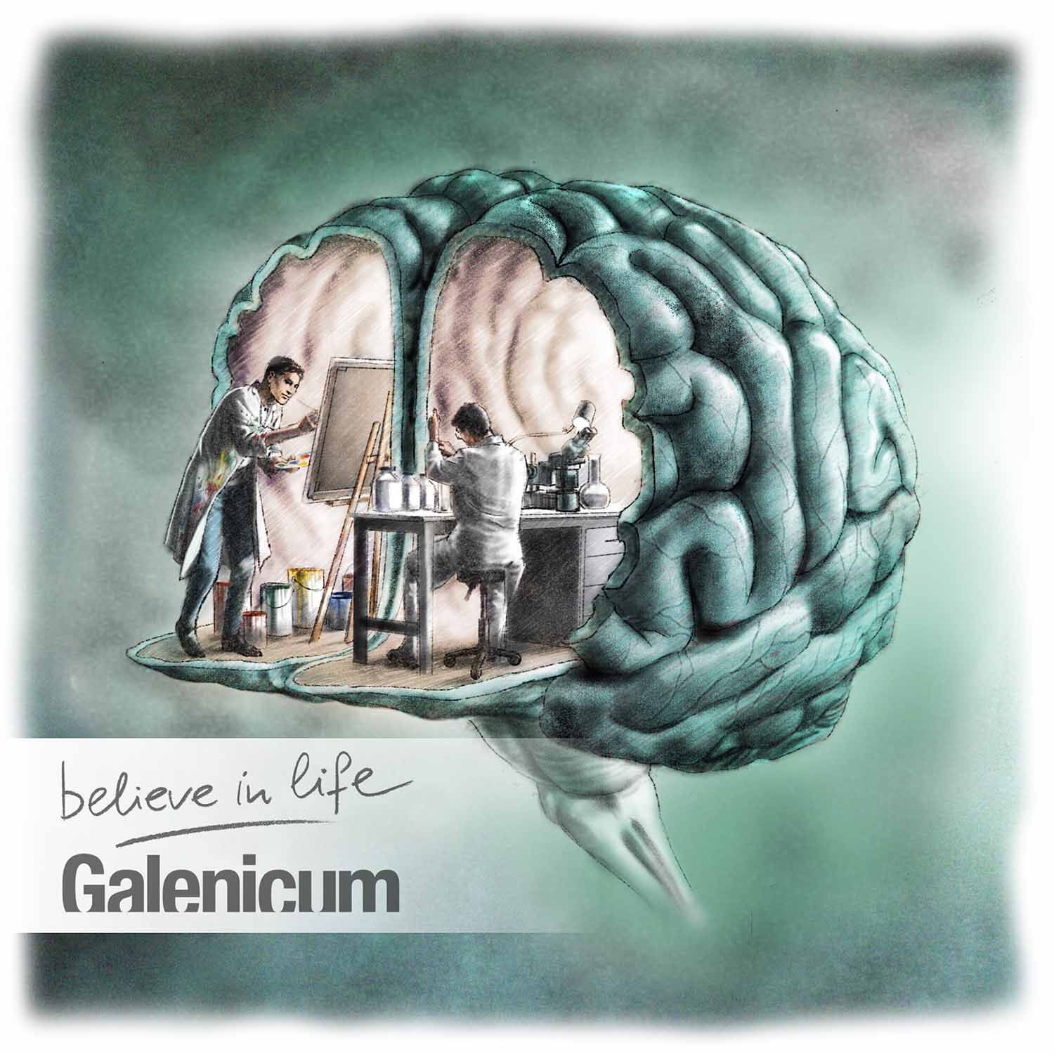
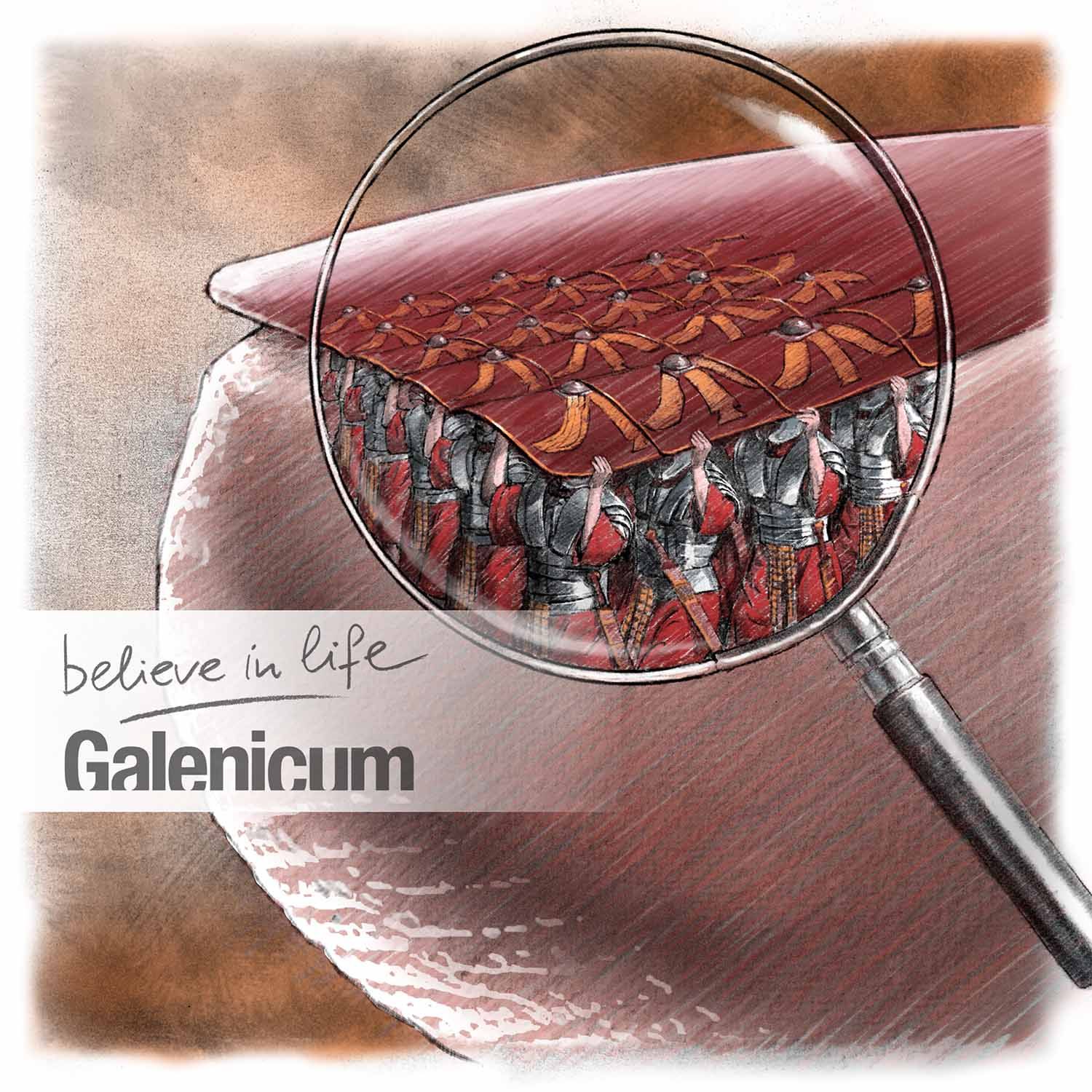
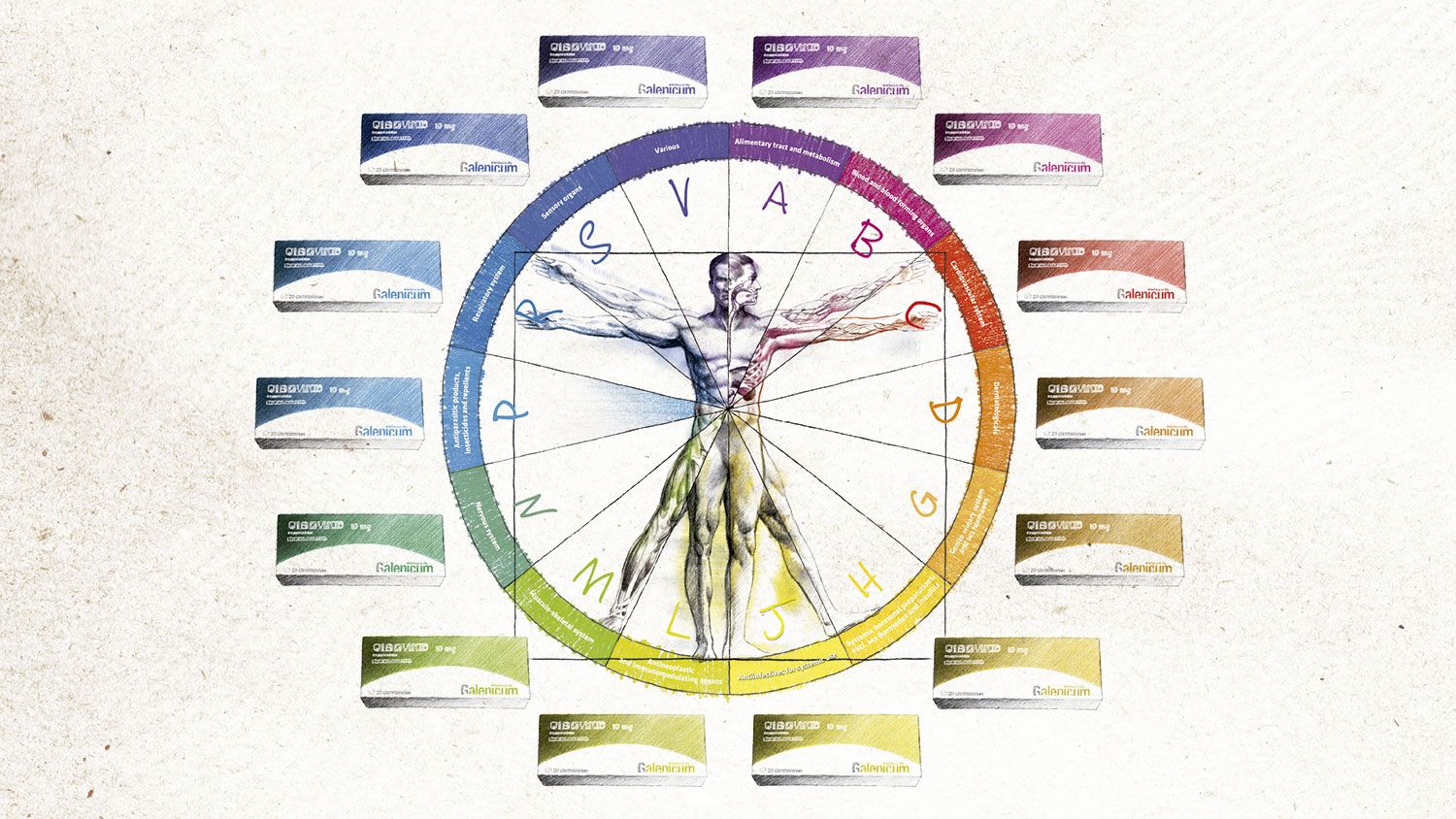
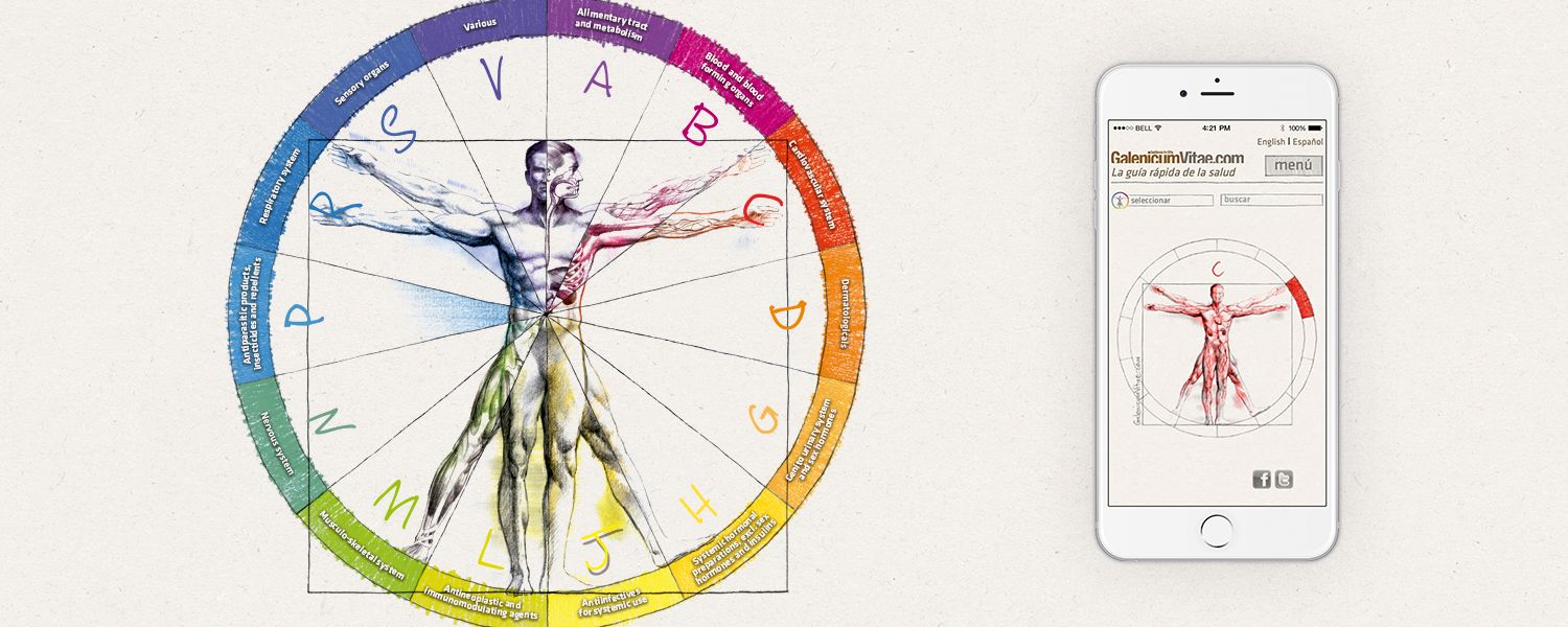
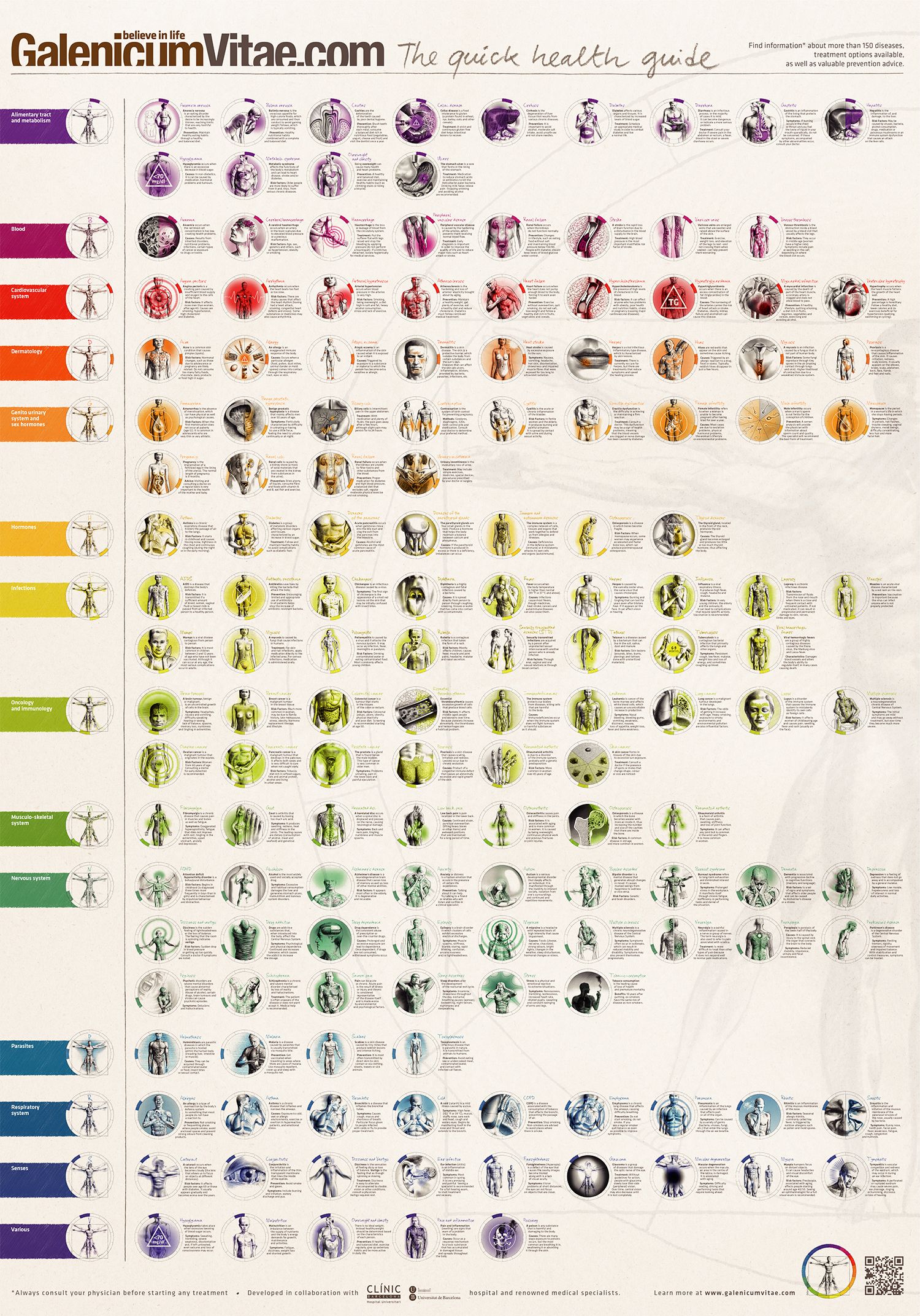
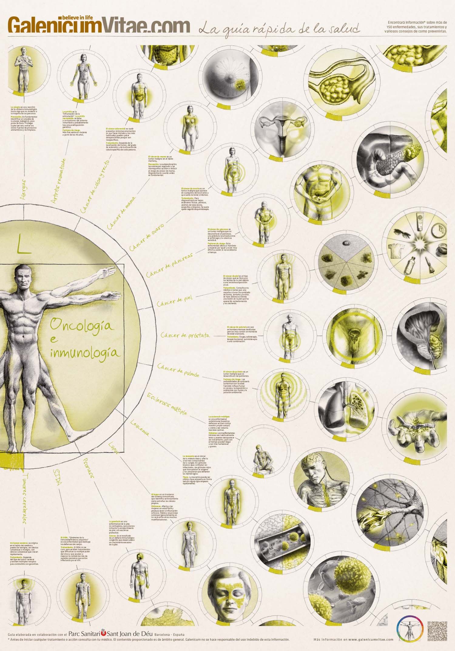
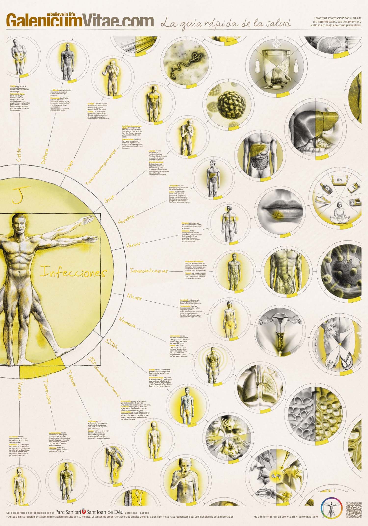
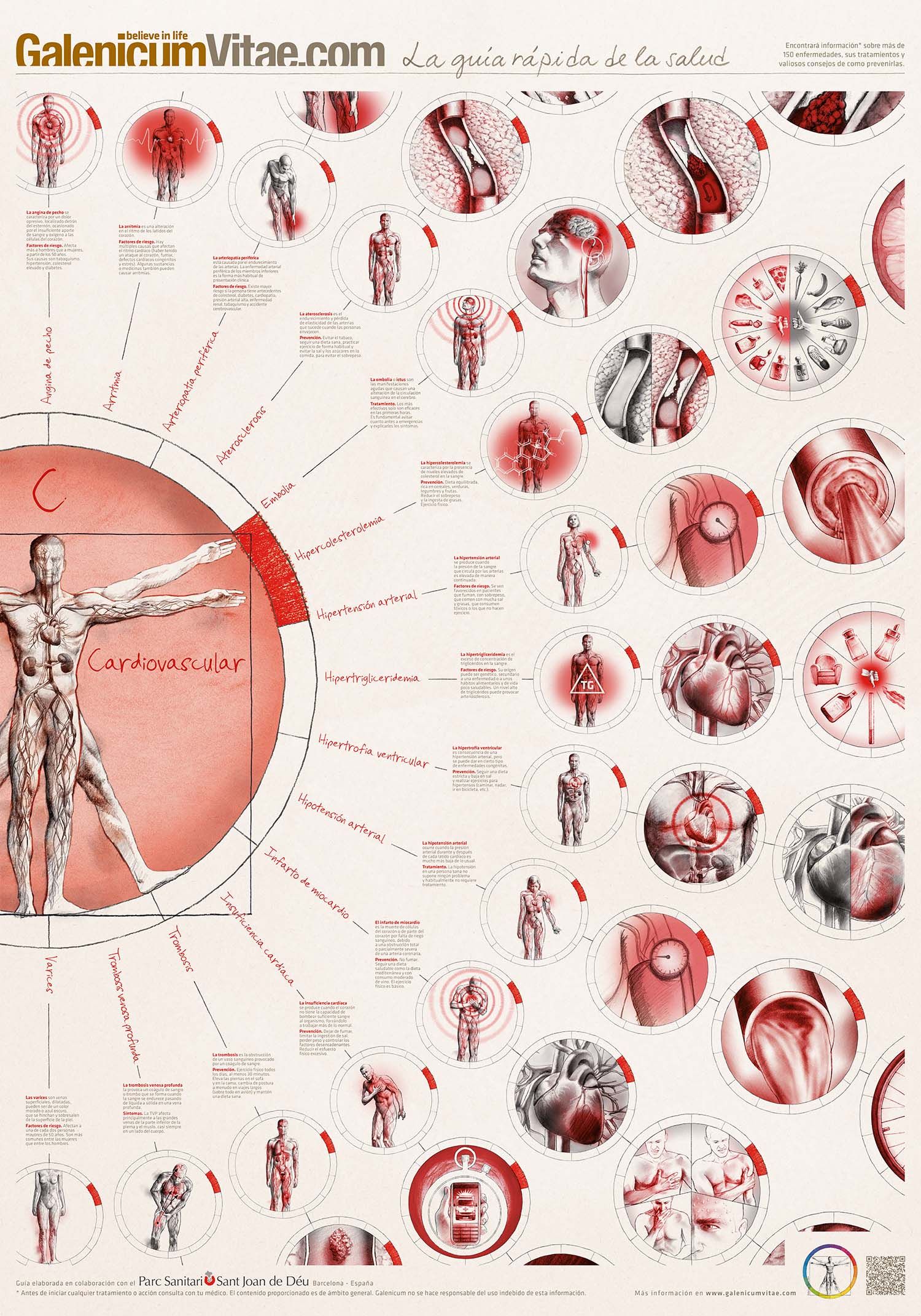
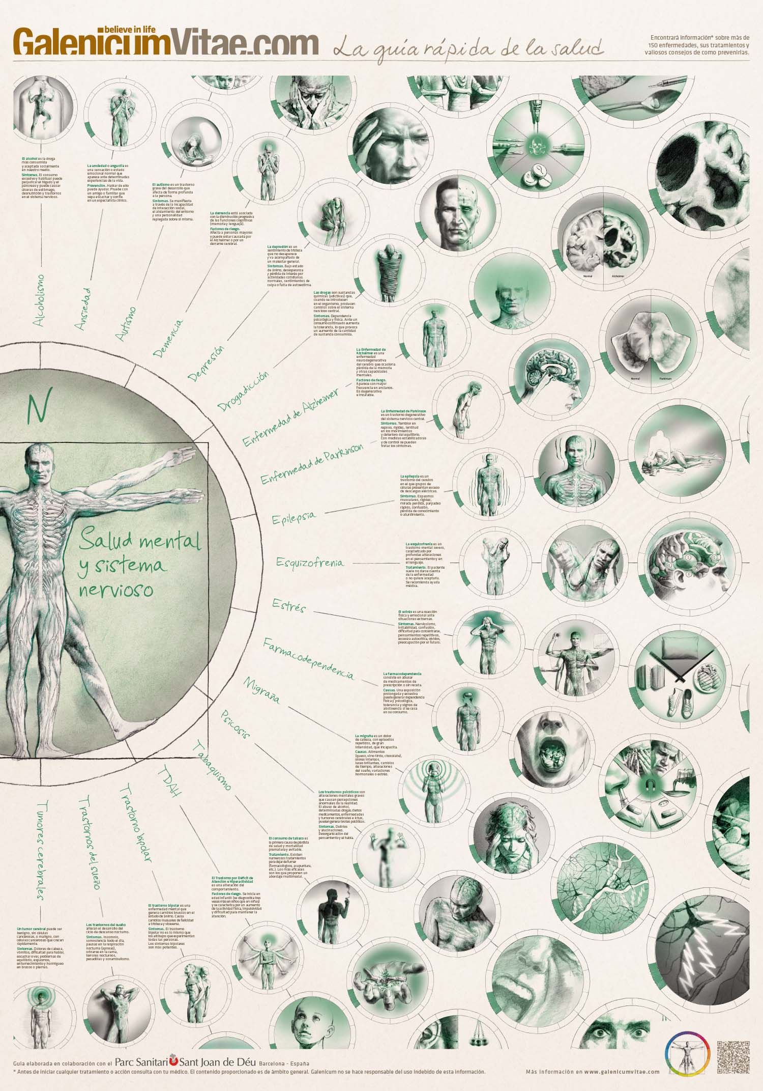
understanding health is key for a healthy lifestyle. therefore, making health-related content appealing to everyone, including the younger generations, is essential to enhance people’s health and lives. we are creating a number of eye-catching and didactic visuals that are used both on online and offline materials of galenicum.
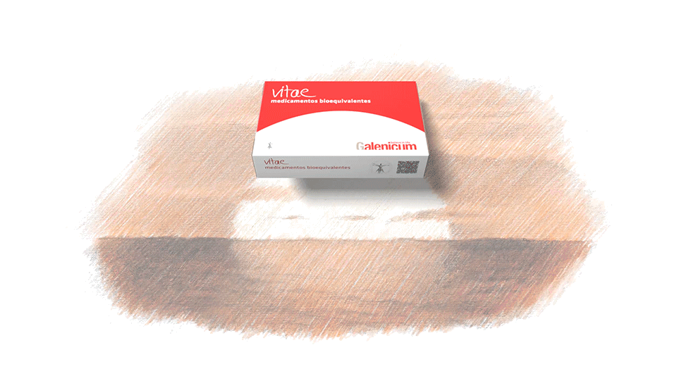
we created the name ‘vitae’ meaning ‘life’ in latin, for galenicum’s bioequivalent medicines, introducing its brand essence on the product itself too. besides we developed a packaging design inspired by the shape of sunrise, which represents the start of a new day and the overcoming of disease. thus, both name and packaging contribute to a consistent brand identity based on the “spirit of overcoming”.
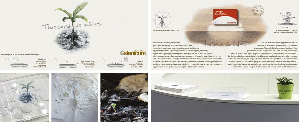
the paper used for this card contains seeds. after some weeks in a recipient with water, flowers grow from the paper, thereby conveying the main values of galenicum: life, hope and spirit of overcoming. this “living card” was used during the pharmaceutical fair cphi 2017 and explained galenicum’s brand essence to customers in a striking way, bringing their brand quite literally, to life.
if there is a time of the year when hope is more present than ever, it is christmas. we created and produced this video as a christmas greeting for galenicum’s customers, conveying the message that the most valuable gift you can give away is hope. this provides a strong reminder of galenicum’s brand essence.