the pharmaceutical industry is a key market for helping patients to overcome disease. however, in the case of serious pathologies, there is another major component often overlooked in the sector – a patient’s belief that they can overcome disease. this constitutes the key tenant of galenicum’s brand essence that we defined.
years collaboration
projects & materials created
countries implemented
medicines under brand vitae

the brand tagline “believe in life” is a manifesto to the human spirit of overcoming, both for the patient’s personal recovery and the effort of galenicum’s team to develop the best possible treatments. we translated this positioning into a logotype inspired by the sunrise, representing hope, and a visual identity ruled by warm colours. its handwritten headlines give all communication materials a ‘human’ look and feel, which stands out from the common cold and aseptic visual treatment in the pharmaceutical industry.
a boy whose mother has breast cancer helps his family move forward, demonstrating the importance of keeping hope always alive.


these visuals epitomise galenicum’s brand essence: the power of hope and the spirit of overcoming.

“krieen always surprises us with out-of-the-box strategic thinking and great creative ideas. they are really helping us building a unique brand in the pharma industry.”
Erich jw Büchen
CEO at Galenicum Health
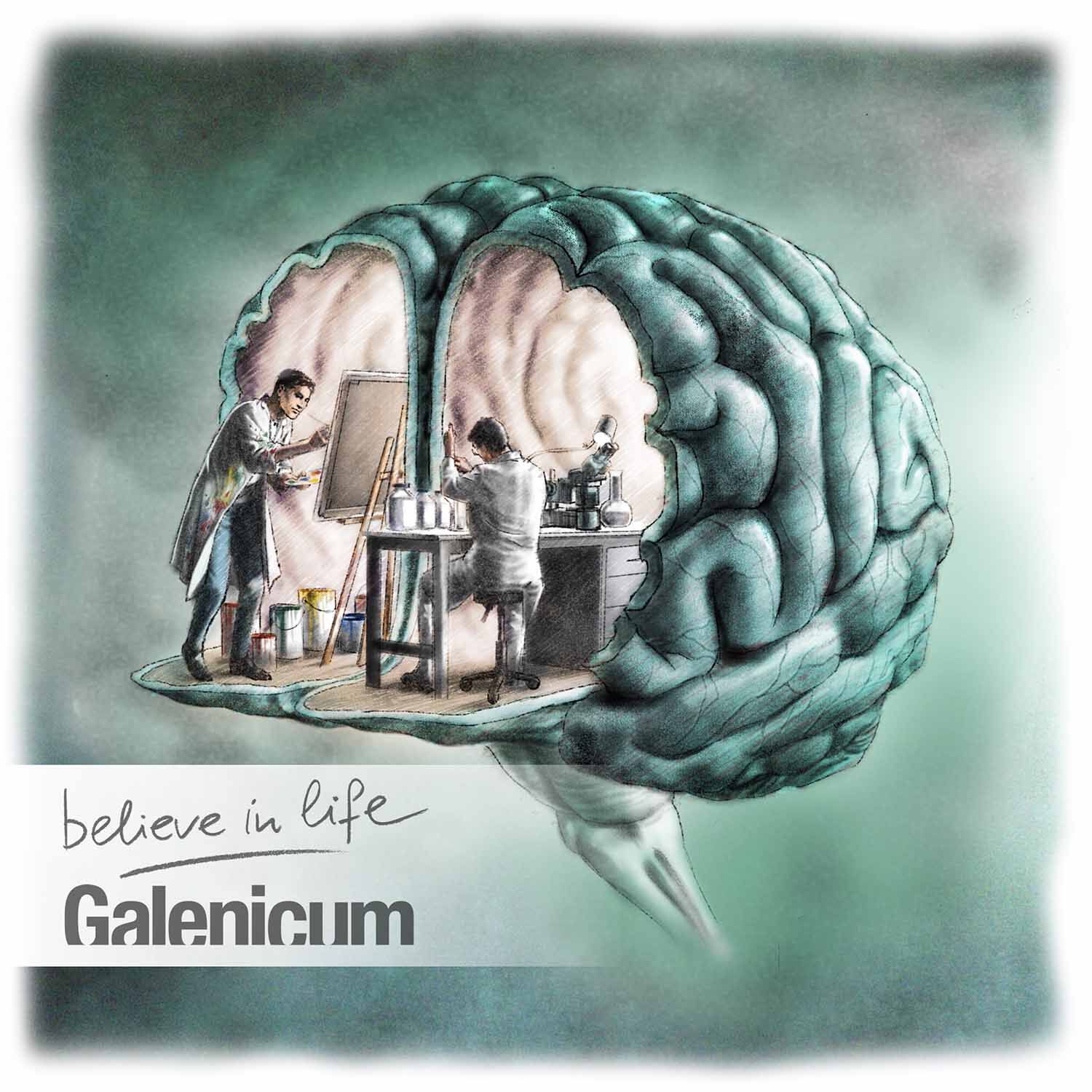
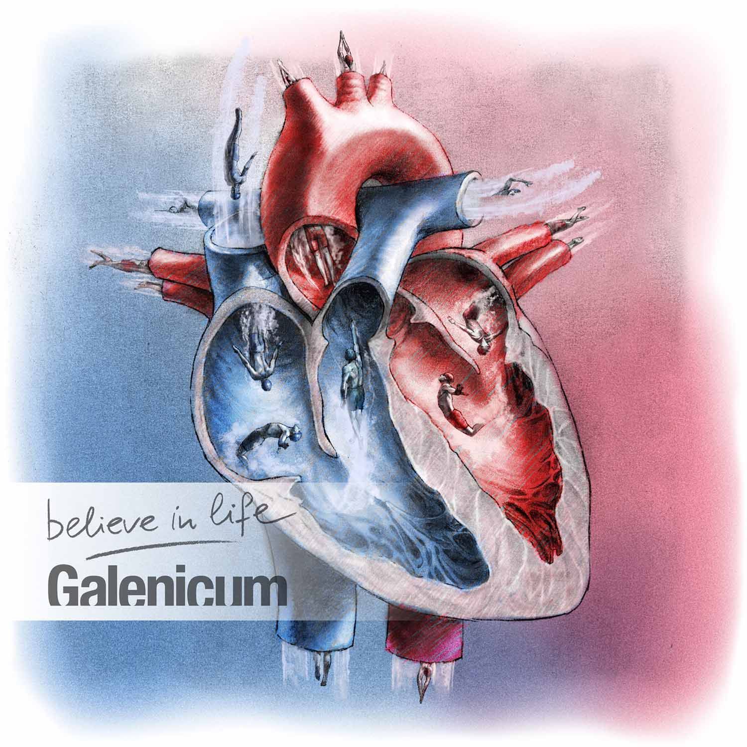
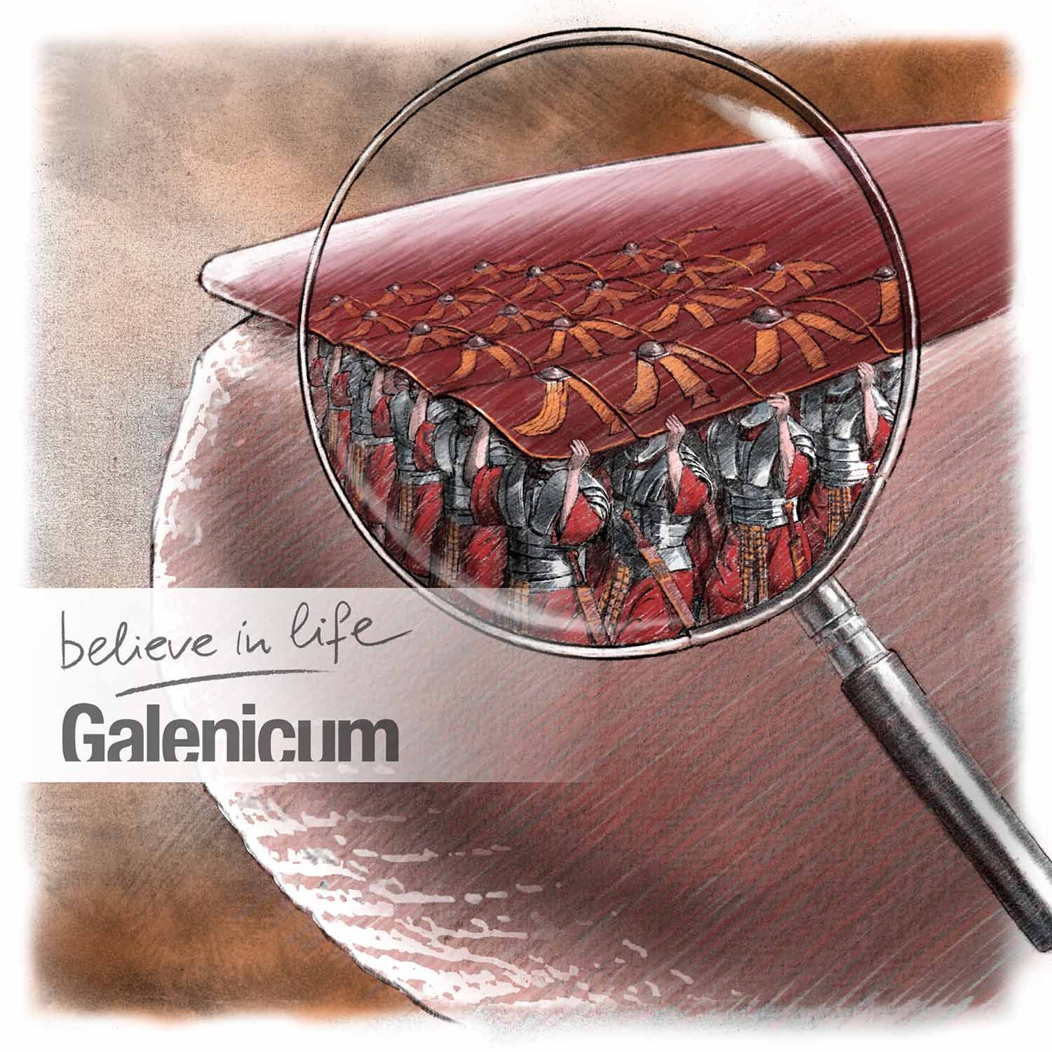
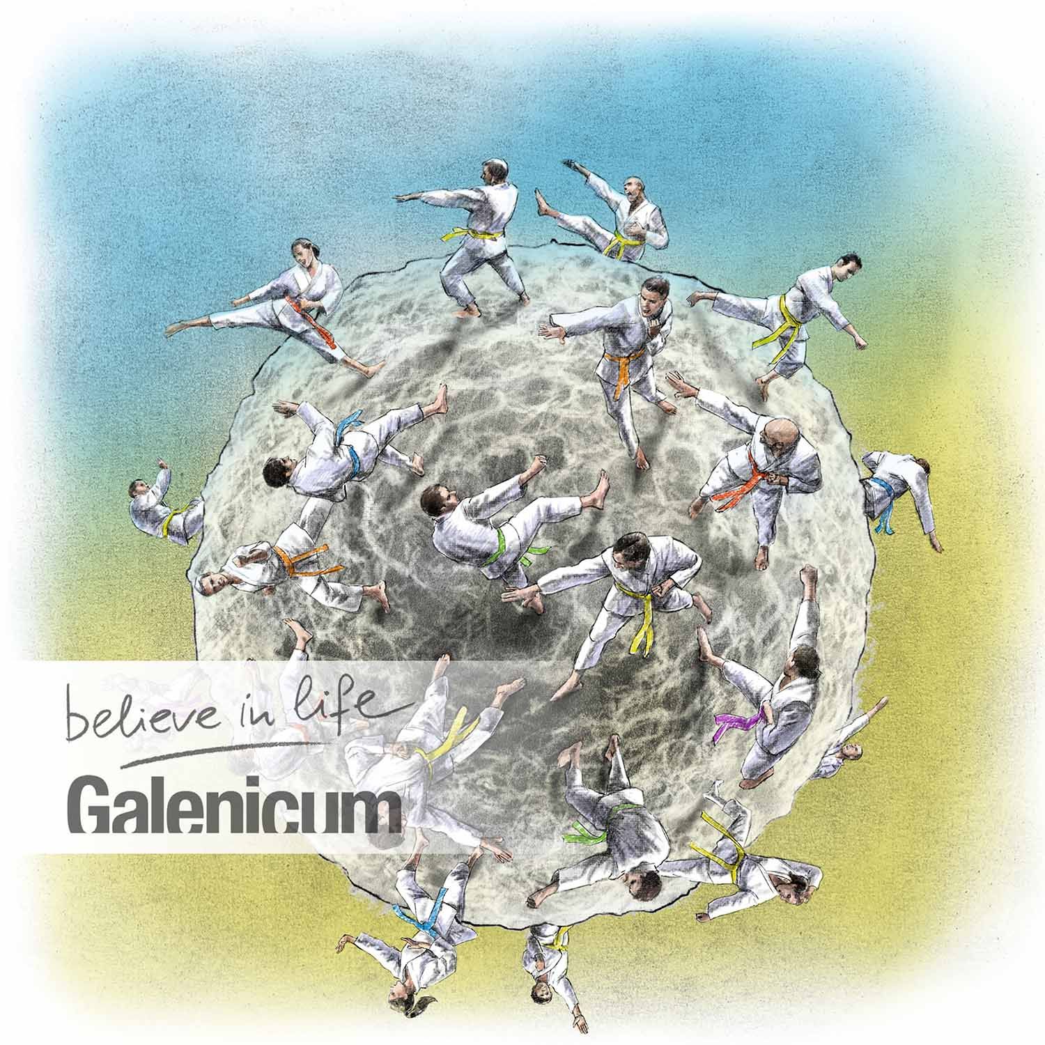
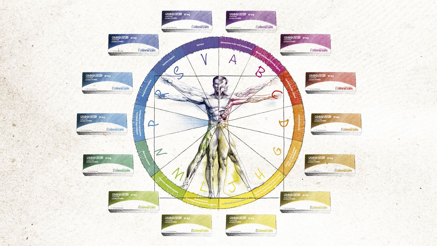
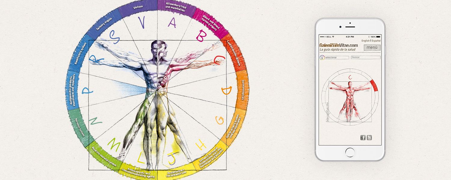
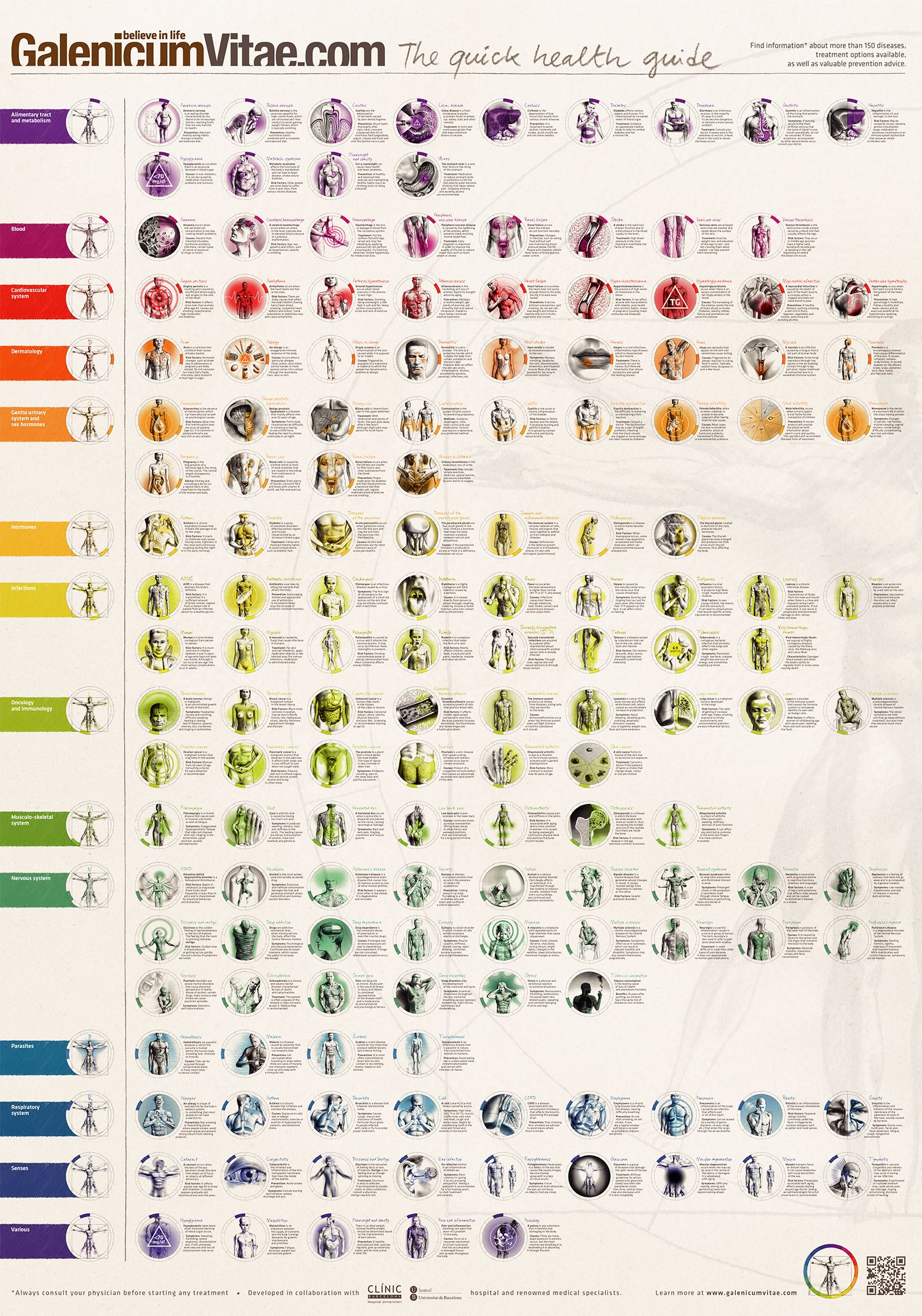
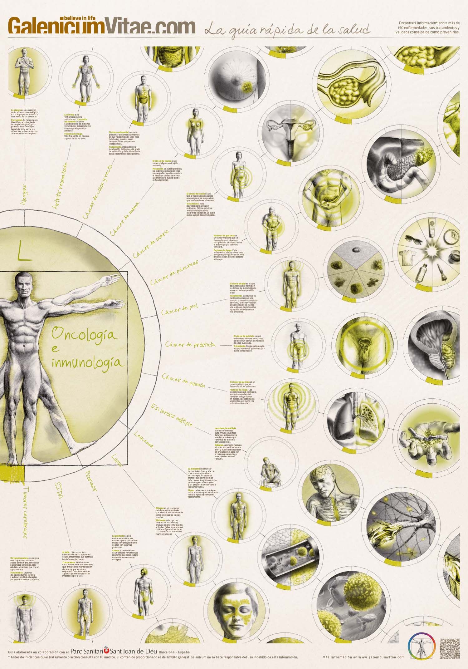
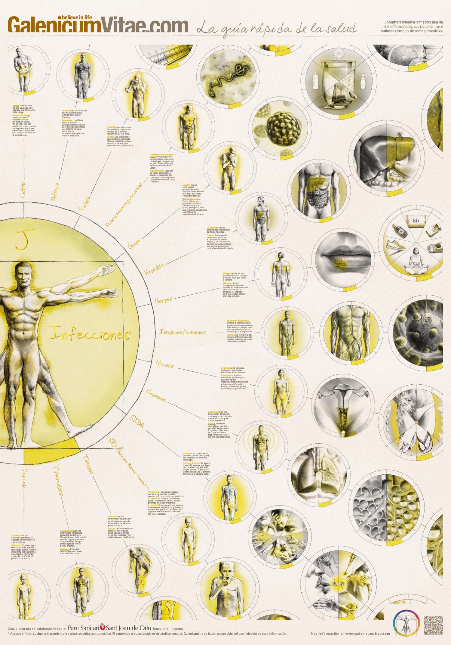
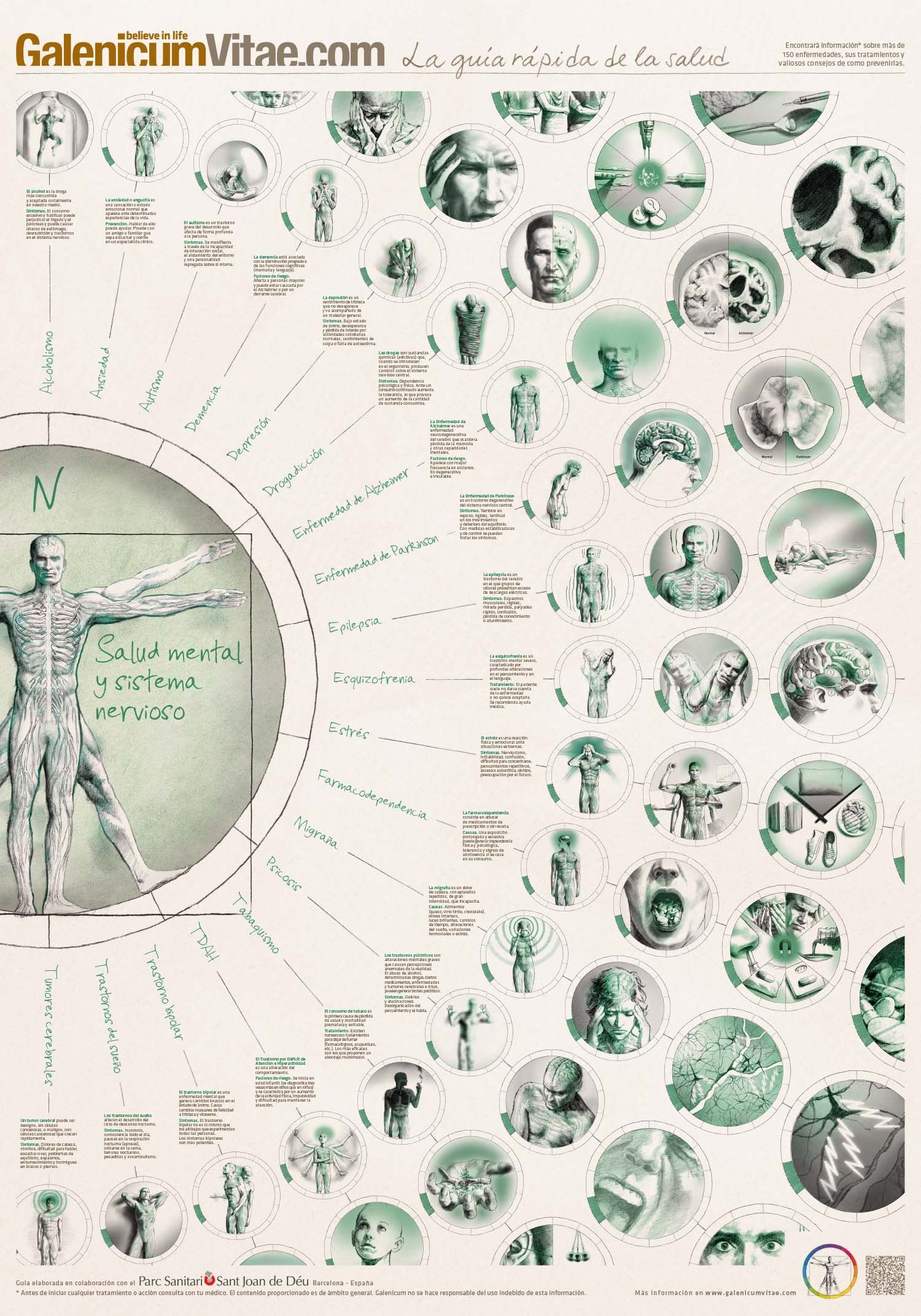
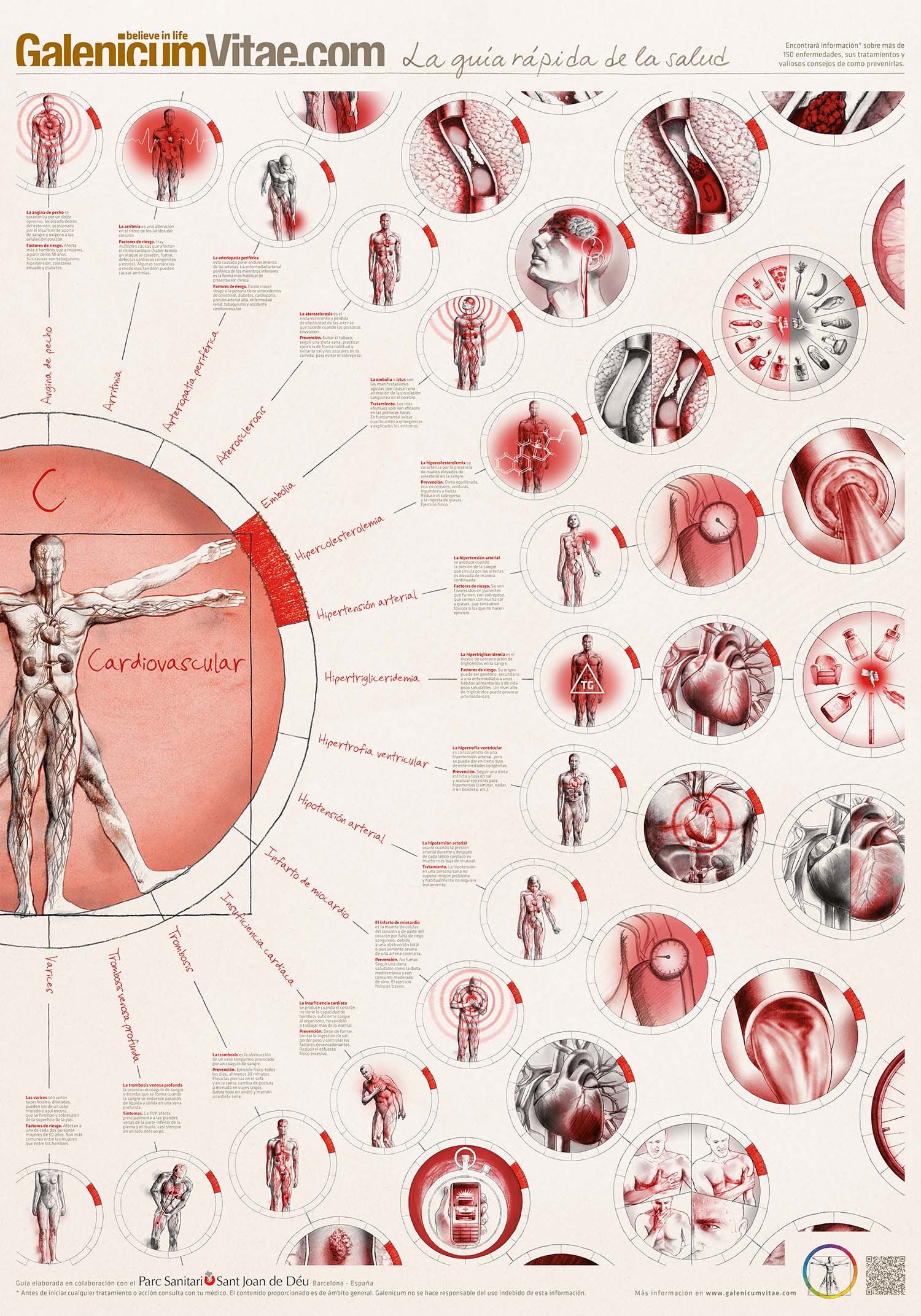
understanding health is key for a healthy lifestyle. therefore, making health-related content appealing to everyone, including the younger generations, is essential to enhance people’s health and lives. we are creating a number of eye-catching and didactic visuals that are used both on online and offline materials of galenicum.
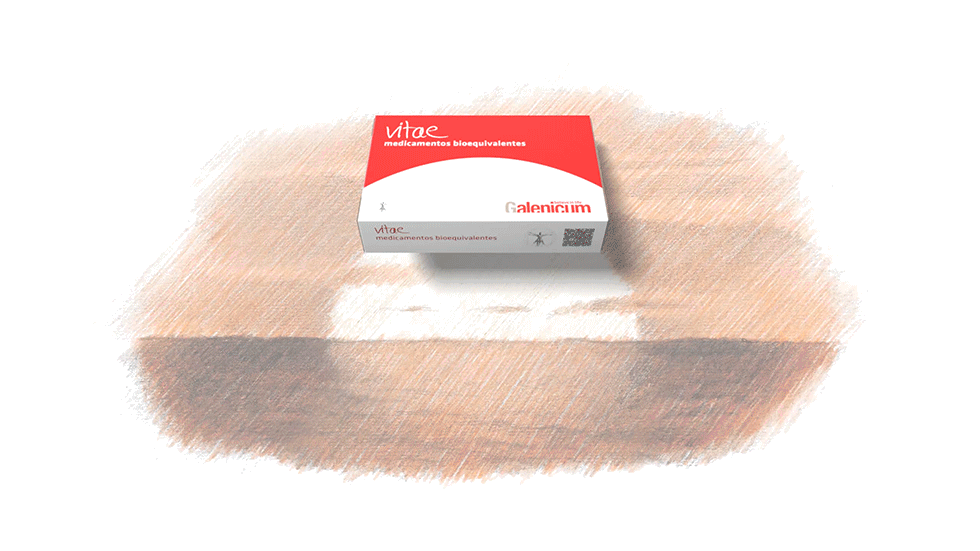
we created the name ‘vitae’ meaning ‘life’ in latin, for galenicum’s bioequivalent medicines, introducing its brand essence on the product itself too. besides we developed a packaging design inspired by the shape of sunrise, which represents the start of a new day and the overcoming of disease. thus, both name and packaging contribute to a consistent brand identity based on the “spirit of overcoming”.
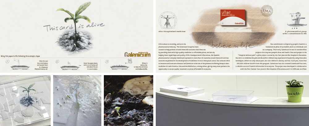
the paper used for this card contains seeds. after some weeks in a recipient with water, flowers grow from the paper, thereby conveying the main values of galenicum: life, hope and spirit of overcoming. this “living card” was used during the pharmaceutical fair cphi 2017 and explained galenicum’s brand essence to customers in a striking way, bringing their brand quite literally, to life.
if there is a time of the year when hope is more present than ever, it is christmas. we created and produced this video as a christmas greeting for galenicum’s customers, conveying the message that the most valuable gift you can give away is hope. this provides a strong reminder of galenicum’s brand essence.