exsyn: a comprehensive rebranding that claims the role of people in the pharmaceutical and chemical industries

the indian company exsyn, specialized in sourcing pharmaceutical and chemical products, celebrates its 30-year anniversary with an overall rebrand and new website. read more

the indian company exsyn, specialized in sourcing pharmaceutical and chemical products, celebrates its 30-year anniversary with an overall rebrand and new website.

we have been in charge of defining the new brand strategy, corporate identity and website. the new brand builds upon their core strengths as a sourcing company and captures their most essential duty: helping improve people’s health and lives.

the whole project revolves around the creative concept “where there is chemistry, we see people”. in a rather cold and scientific environment, this idea wants to highlight the role of people in the pharmaceutical and chemical sectors, from patients, to families, to b2b customers. read less


positioning · tagline · key visual · homepage · communication code

about the key visual

the concept has been brought to life with a memorable visual on the homepage that wants to challenge everyone visiting the new website by making them look twice. when visitors look close enough, they can recognize either a test tube or two faces. this visual dialog shows how chemistry and people are a whole and always go together. the visual is inspired by the gestalt theory, an important school of psychology founded in germany and austria in the 20th century that laid the foundation for modern study of perception. their main thesis was that the whole of anything is greater than the sum of all its parts.


logotype · corporate identity · brand icon

about the corporate identity

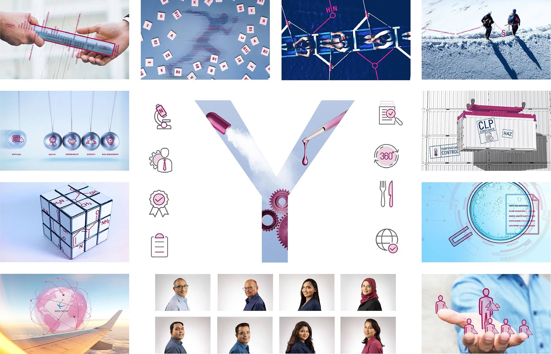
in terms of colours, the new corporate identity combines an elegant dark blue standing for science, reliability and transparency with a lively magenta-red that captures exsyn’s passion for chemistry and health. the logo represents one of exsyn’s most strategic services – custom synthesis – through the “y” icon. this funnel-shaped letter symbolizes several simpler materials turning into a more complex substance. it also reminds of the synergies and valuable partnerships with exsyn’s customers and trusted manufacturers, with whom they work hand in hand.

website · copywriting · brand visuals · communication code · digital

about the new website

the new website offers a more dynamic, visual and content-driven experience, making it easier for customers to find specific products and start inquiries. the content about exsyn’s key business areas has been significantly extended and carefully structured in the most intuitive manner, with more than 70 categories spanning from apis to construction materials and including a convenient product search function. beyond updating about company news and events, exsyn’s new website will feature relevant content about key products and valuable market insights for their customers through their new blog. as the backbone of the company, the entire team behind exsyn has also gained more presence on the website.

amit timbrewala · president and ceo at exsyn

after 30 years in the life science and chemical industries we felt the need to communicate our core business activities and our corporate purpose through a powerful new brand that empowers the role of people in our sector, be it patients, families or customers. we look forward to spread this message across the globe.

jürgen krieger · ceo at krieen

we are proud of having contributed to exsyn’s transformation through a new brand that reflects their unique way of working and captures their purpose of helping improve people’s health and lives.

more projects