big ideacommercialvideodigitalsocial media

“we must speak the language of our clients. and as a law firm focused on advising technology-based companies we felt the need to communicate in a completely different way than we had been doing before. krieen understood us from the beginning and they have given our brand a unique and memorable story with that ironic and daring point that we fell in love with.”
Ignacio Lacasa
Founding Partner at Across Legal
website designcopywritingimagery
the rebranding also encompassed the creation of a new website under the same creative concept. we have been in charge of the creativity, the design and the creative copywriting of the site.

“the world of law is still very traditional in terms of communication and is not very creatively exploited. this was on the one hand a great opportunity to create a disruptive piece, but at the same time a huge challenge. we are proud to have found an idea that enables across to radically differentiate itself in the industry, while still communicating its services and business value proposition.”
Alex Krieger
creative & managing director at Krieen
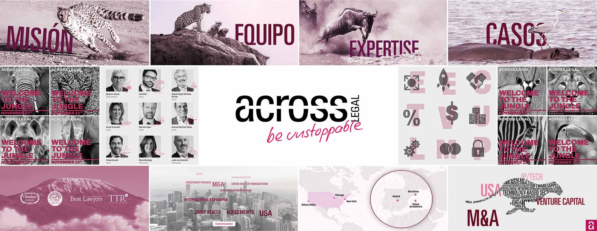
corporate identitylogotypeimageryiconsbrand guidelines
the new logo, designed in lower case with a bold and condensed font, represents the companies mission itself. the letters symbolize the trees in a lush jungle, whereas the line crossing the logo depicts the concept of “being unstoppable” from the beginning to the end of the legal process. the result is an elegant and strong logo full of meaning. in terms of colors, the magenta red stands for passion, whereas black stands for letters, words, laws…