the nutritional supplement industry is fraught with harsh competition, which leads to an endlessly growing variety of similar products. a meaningful brand story, a didactic name, a fresh visual identity and product-focused communication materials are helping stop&go create consistent brand awareness when entering markets such as spain as well as arabian and latin american countries.
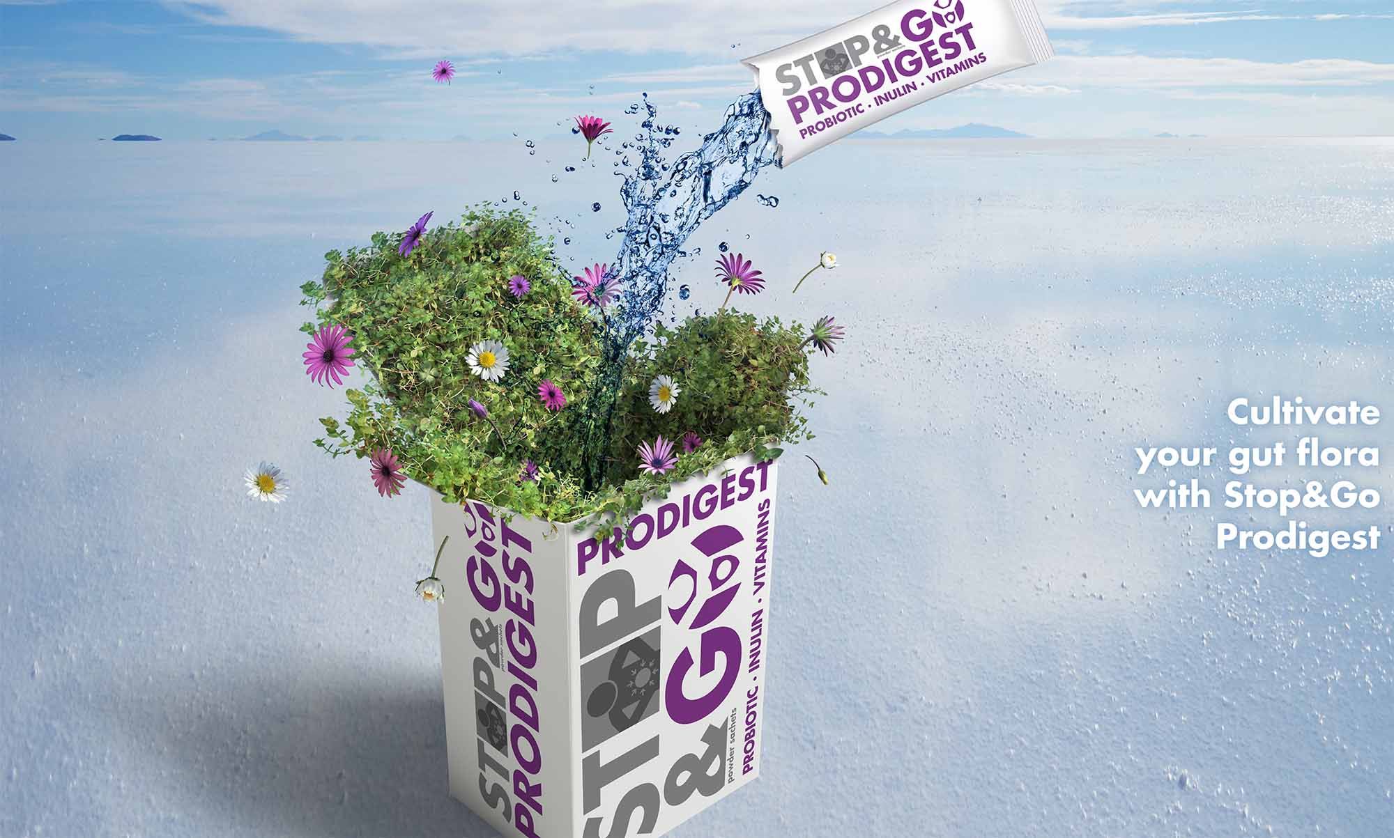
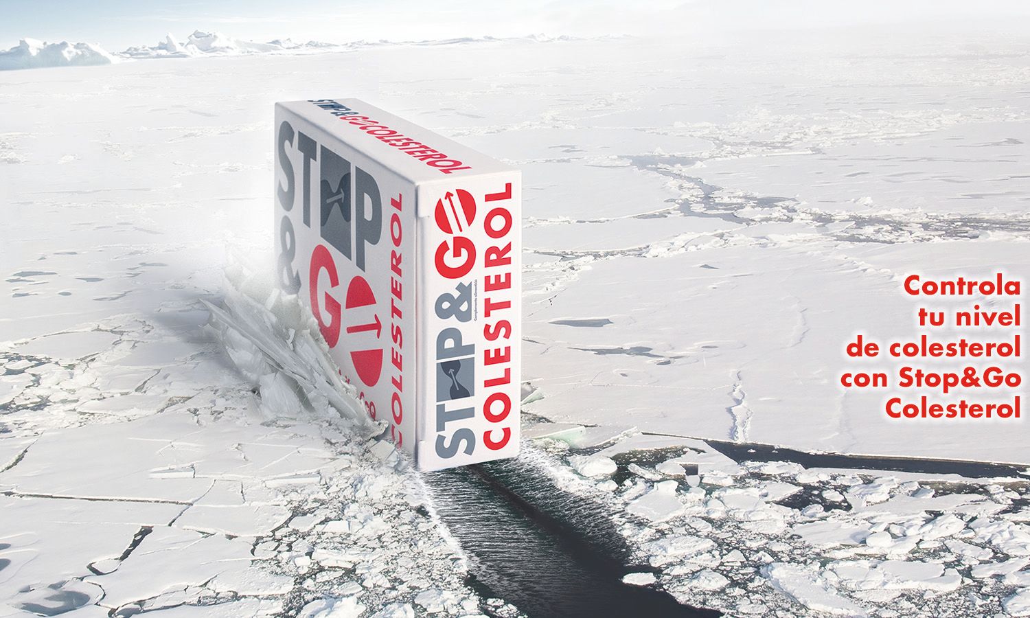
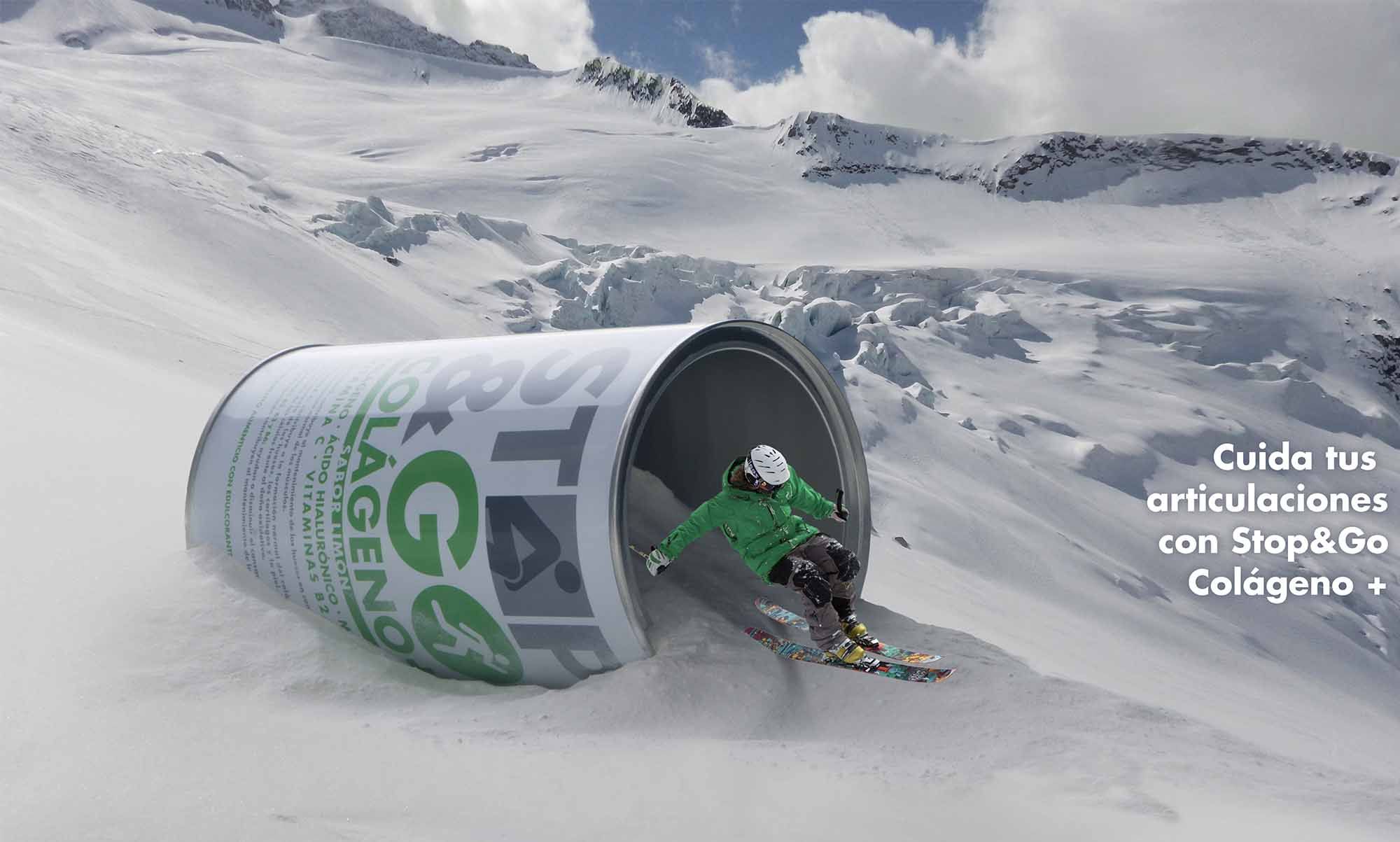
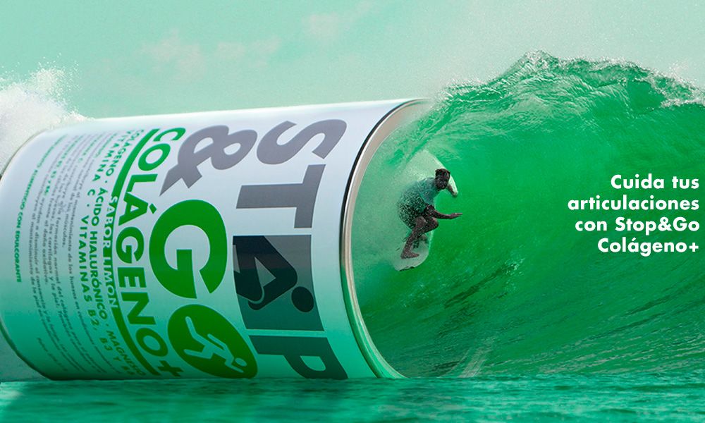

we created a series of print ads that clearly showcase the benefit of each nutritional supplement through the very package, which is always the star in stop&go’s communication materials. for example, a surfer rides a wave through a collagen can.
years collaboration
projects & materials created
countries implemented
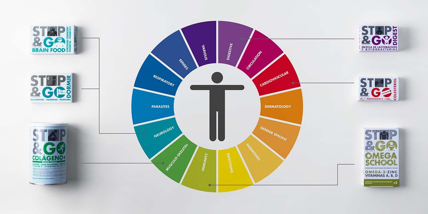
food supplements under the brand stop&go

“krieen always surprises us with out-of-the-box strategic thinking and great creative ideas. they are extremely passionate about what they do and their proactive attitude is very valuable, especially for long-term partnerships.”
Erich jw Büchen
CEO at Galenicum Health
we are in constant motion. however, sometimes obstacles stop our everyday life, such as a cough, insomnia or high cholesterol levels. the brand stop&go represents these little hurdles and how to overcome them: by keep going with nutritional supplements. the fresh and young design makes stop&go stand out among a huge range of competitors.
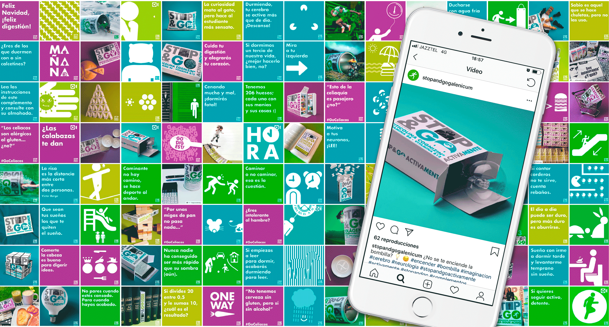
creating product-focused but appealing social media content is the key to raise stop&go’s digital brand awareness.
a video of an ordinary cyclist riding his bike with an end that is nothing but ordinary. we both created and produced this video for stop&go collagen+.